Human-first accounting
Partners in Enterprise
Introduction
Paving the way for a new kind of firm
Some accounting firms are just different from the rest. They don’t just focus on numbers; they also understand the emotional and personal stories behind their clients’ financial choices.
One such firm is Partners in Enterprise (PIE). A father-son duo based in Brighton, they’re trailblazers, compassionate thinkers, and financial wizards with a vision for the future. All they needed was someone to facilitate turning those concepts into something real.
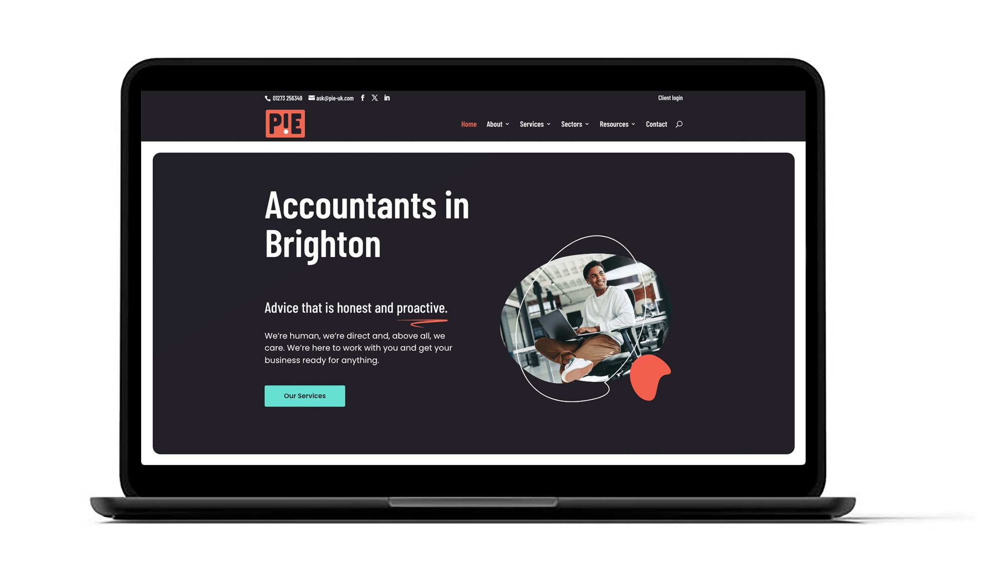
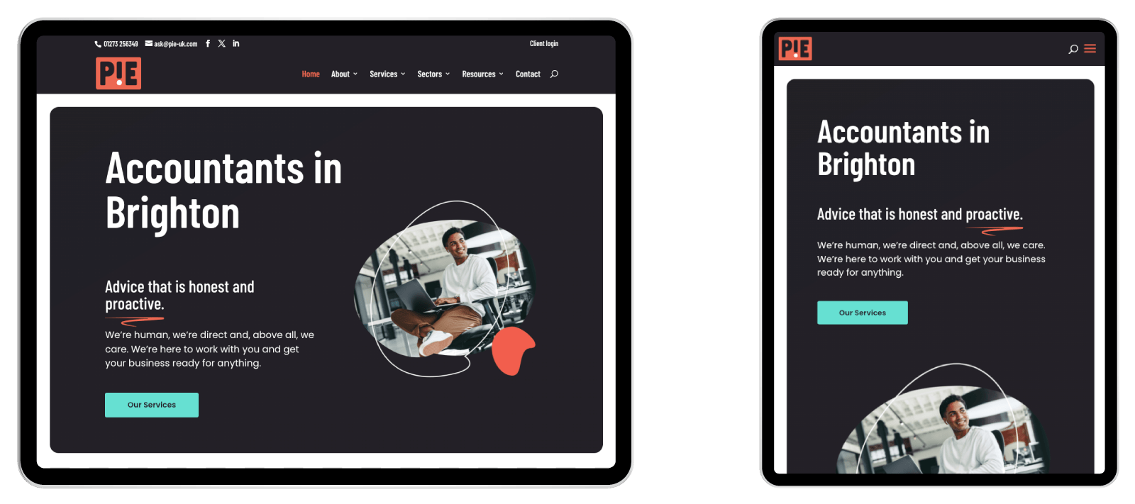
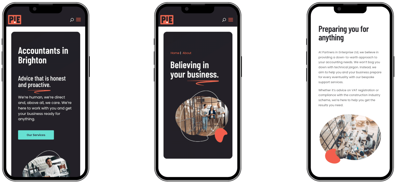
That was in July 2022 — now, PIE has a website that demonstrates what makes them unique. They’ve got a regularly updated blog with thought-provoking and informative content. And they have a clear digital ‘shopfront’, a site that highlights their considered and forward-thinking approach without sacrificing their technical expertise.

Results overview
Slick website design
Highlighted expertise for entrepreneurial business owners
Modern eye-catching logo
“We love our new brand and website, it definitely helps us stand out from the crowd and secure new business.”

Ryan Headlam, Director
Partners in Enterprise
The challenge
Taking brave steps
PIE knew that to get more of the bigger clients, they needed a strategy to suit them. They needed a website that allowed their ideas to breathe, inviting their potential customers to experience what they’d be like to work with.
With this new positioning, a new logo was a necessity — a design that was modern, recognisable and confident. One their new leads would never forget…
The Solution
Shining a light on personality
For a client like PIE, we needed to ensure every ounce of what made their brand special was captured. We hosted full content and design workshops designed to eke out every last juicy detail and give them a clear outline of how our processes would help them achieve their goals.
In the design workshop, we identified clear areas where PIE was strong and created concepts based on each area. These areas were:
- The data-driven uplifter
- The calm analyst
- The friendly adviser
- The inspiring ally
These concepts serve to indicate the direction in which PIE might want to take its branding. Along with four distinct logo designs for each, our designers explained to the team why they thought each idea could work and what it would look like in reality.
Then we defined PIE’s strategy. Who did they want to target? What made their clients tick? How could they display this on the new site? What content would help them get there? All of these questions are important in defining a brand, its mission, and what that means to its clients.
Next, a dedicated content workshop, exploring how PIE would sound, what words were important to help their communication get stronger, and how we could build the site in a way that would match who they are. We used some open-ended questions, visual exercises, gut tests and written exercises to find what was vital to get right in how PIE sounds.
Design, content, strategy — with our support, PIE was on the right path — but what was the final result?

The results
Becoming pioneers
A clear and vibrant website that puts PIE’s humanity, expertise and prestige front and centre.
A bold and confident logo with visual flair and warmth, something often lacking in other designs in the accounting field.
A marketing strategy the team could run within the months and years ahead – one that defined their best route to success.

Kick off your growth journey
Our digital marketing services will set your firm apart from your competitors and provide clear, compelling messages for your ideal clients..
Give us a call on