
Rise Audit
Creating a brand and website for a challenger audit firm
Rise is a new audit firm with a new way of doing things. Based on the core belief that audit clients deserve better treatment, its bold approach aims to engage its audience and disrupt the market.
We worked with Rise co-founder Robert Stell to build this challenger brand from scratch, developing its central values and identity, all the way through to building a website and producing branded video content.
Services
Research
Branding
Web design and development
Copywriting
Video
Project duration
Just over a year, from first workshop to brand launch.
Project focus
Launch a new challenger brand to disrupt a highly competitive and well-established market.
Team


The challenge
Robert Stell started working with us because he had tested the water with an audit service under an existing brand and sensed that it wasn’t connecting with the right clients.
Looking at his existing brand, we identified the sticking point – the identity and content was focused on small and micro-businesses, rather than on potential audit clients.
How we helped
1 | Brand identity and values
The new brand, Rise, is precisely targeted at chief financial officers (CFOs) and finance directors (FDs) who might be looking to buy audit services, or change audit suppliers. It speaks to that audience’s wants and needs, and offers something completely different from existing, more traditional audit brands.
2 | Audience testing
We tested Rise’s value proposition by carrying out research with senior finance professionals. Their opinions on audit helped to back up the underlying assumptions behind the brand and to further sharpen the focus.
3 | Design, tone of voice and brand guidelines
Our designers and copywriters translated the central message and values of the brand into an impactful visual design and complementary tone of voice. These were set out in detailed brand guidelines to ensure Rise’s identity would be consistent across all platforms and projects.
4 | Promoting with multimedia content
We worked with Robert to produce a content strategy including a 10-point manifesto to give direction and focus to the content. To help get those points across, we produced a series of short videos, as well as blog content that underlined the theme of challenge and disruption.
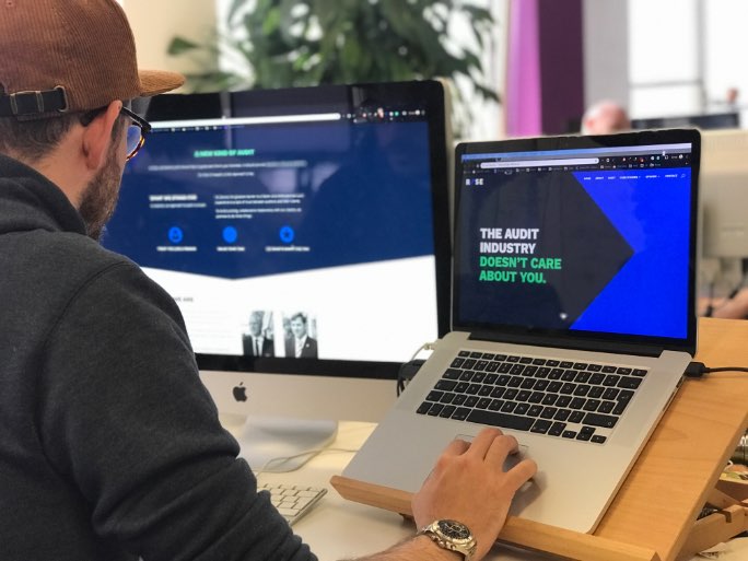
5 | Website design and development
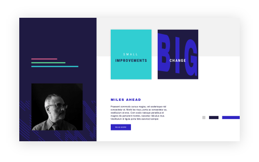
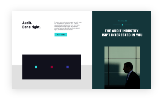
The finished Rise website pulls together the initial brand strategy work, along with design and copywriting, to create something that’s unlike anything else in the audit market.
Branding
Brand isn’t just about logos and colours – it’s a way of understanding the values and personality of an accountancy firm, or audit firm as in this case, and ensuring that the website, marketing materials, content and design elements support and signal that unique identity.
Strategy is at the centre of our branding process. We believe it’s essential to understand who your customer is, and what you want to achieve, before going on to develop any of the content, design or platforms that will build your brand.
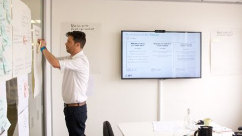
Mike Crook, managing director of PracticeWeb, leading the rise brand strategy workshop.
The values that guide our business
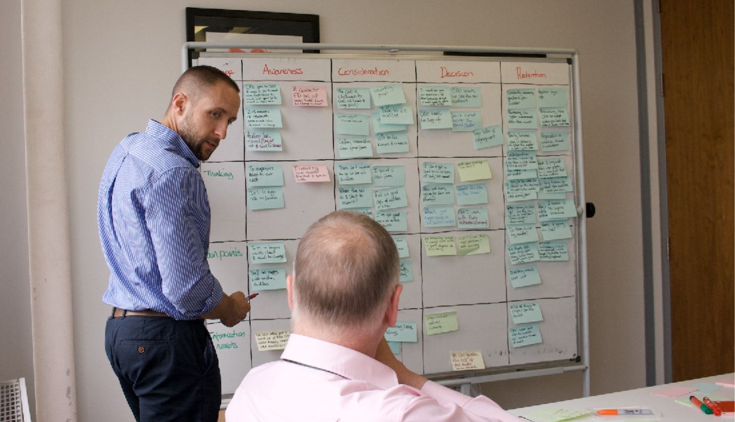
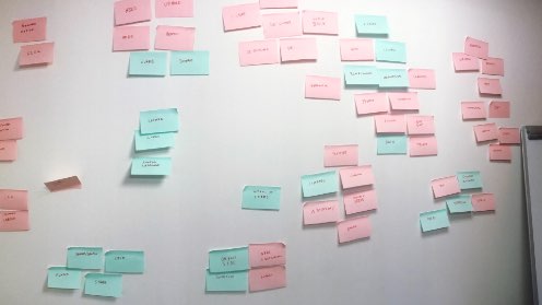
After initial getting-to-know-you discussions, the first step was a brand and marketing workshop in which we worked with Robert to understand the type of clients he wanted to attract, what his business and marketing goals were, and how he could differentiate his business from other audit firms.
What emerged was a genuinely distinctive statement – that audit could be done differently, in a way that would be better for clients. It was clear, powerful message that stood out from Robert’s competitors and, crucially, reflected a strongly held personal belief.
Drawing on conversations in the workshop, we identified four key values at the heart of the Rise brand:


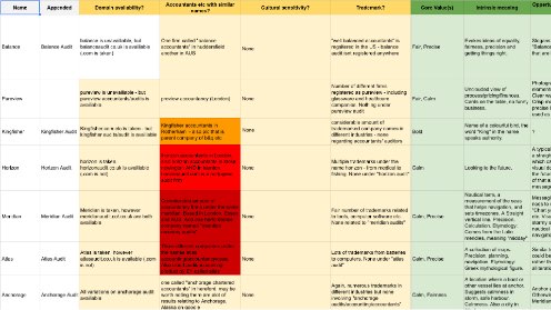
Choosing the perfect name for a challenger brand
The new brand needed a name. It had to encapsulate the personality we’d defined and also stand out from the competition.
To get there, we came up with many possible names and tested each one against several criteria.
First, we looked at the meaning and possible connotations of each name – could they be misconstrued? Were there possible negative connotations?
Next, we tested them out loud, including our ‘telephone test’ – how did it feel to answer the phone and say each one to the person on the other end of the line?
Then we checked for copyrights, competition and website domain availability – the perfect name isn’t perfect if you can’t get the website, or it’s already being used by another firm in the same sector.
Finally, we presented a shortlist of three options to Robert. He picked the name Rise, which we all agreed combines the brand’s rebellious energy with a sense of positive movement.
Thinking visually
Drawing on the brand messaging and the new name, we put together a list of descriptive terms to inspire the design. Using these, we developed three possible visual directions.
Upwards
Speed
Motion
Upwards
Speed
Motion
Direction
Perspective
Growth
Forwards
Uplift
Expand
Direction
Perspective
Growth
Forwards
Uplift
Expand
Stand out
Independence
Distance
Correctness
Individual
Personal
Higher
Climbing
Expert
Three proposed art directions
The final brand
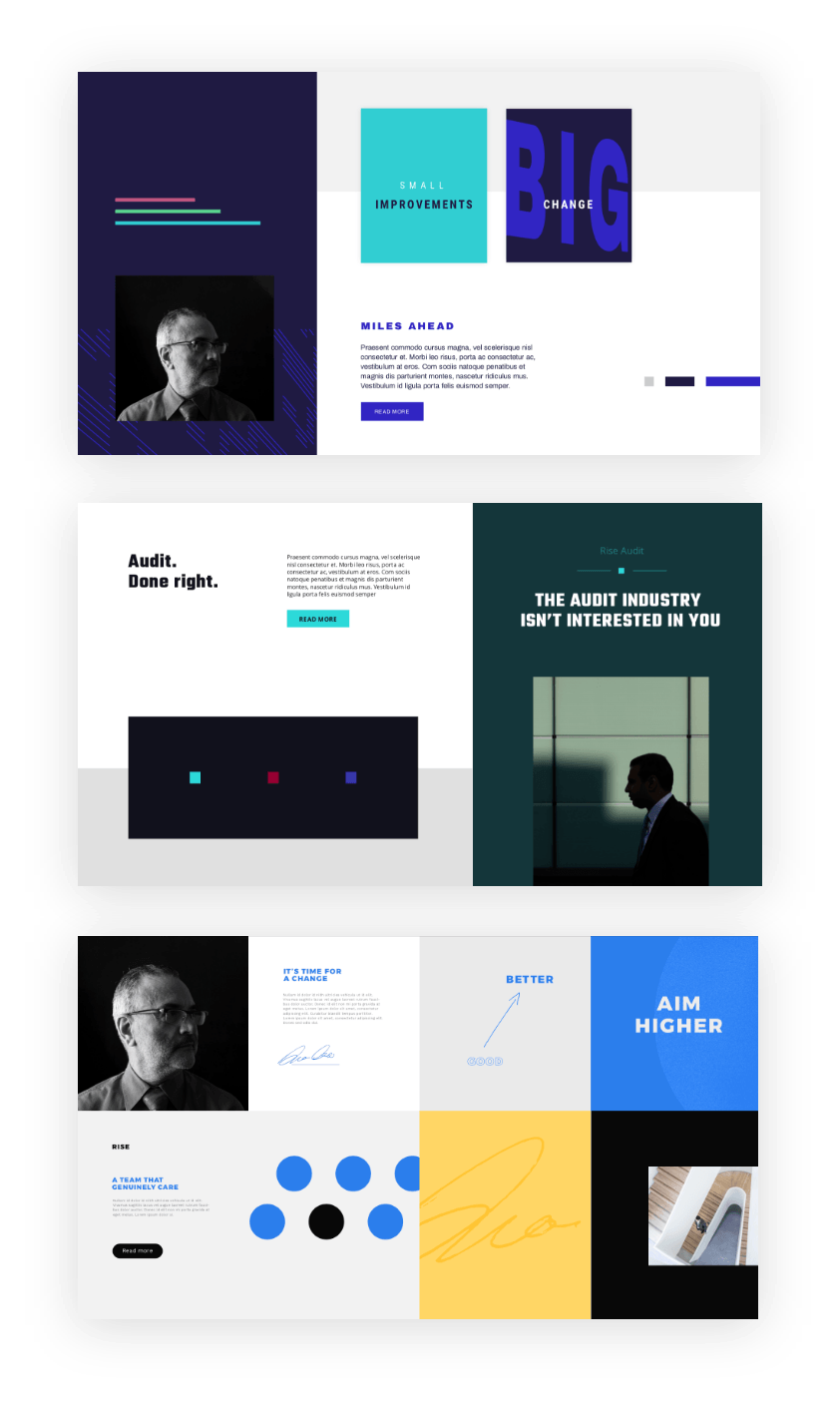
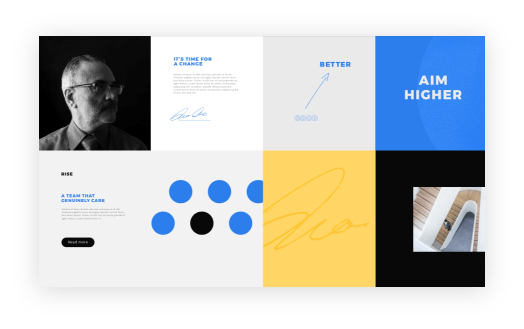
In the end, we went with the first option: a design that employs a striking colour palette, with bright pops of colour against a blue base tone, complemented by carefully-chosen photography, simple icons, and a pointedly unconventional layout. The font is heavy but human, and text is given the space it needs to make an impact.
Imagery relating to arrows runs throughout, linking back to the logo and suggesting the same sense of positive energy.
In line with the Rise brand, the design is bold without being brash – it’s not afraid to do something different or stand out, but is also serious, professional and calm.
Visuals

Primary palette

Highlight palette

Neutral palette
Illustration Library
abcdefghijklmnopqrstuvwxyz
ABCDEFGHIJKLMNOPQRSTUVWXYZ
abcdefghijklmnopqrstuvwxyz
ABCDEFGHIJKLMNOPQRSTUVWXYZ
Typography


Photography
Videos
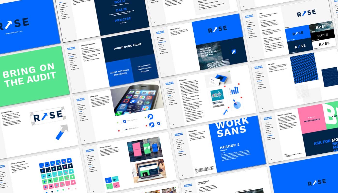
Brand Guidelines


Beautiful on desktop
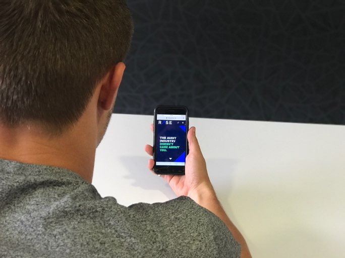
Beautiful on mobile
“Working with PracticeWeb has been a hoot. Nothing less than really good fun. If one gives over completely to the process – and it really is a process – then it can get really get quite creative.
“Once immersed, I have to say it’s been very enjoyable. I visited them rather than the other way round and I think that physical separation improved my thinking. What has emerged is really quite impressive.
“They have a multi-layered team and many, many heads get involved. I recommend them highly.”
Robert Stell
How can we help you?
Proud to be working with:


