

Accounting websites should be used to generate leads, build trust with your audience, share expertise, attract new talent, and, ultimately, make sales. Your website is the cornerstone of your digital marketing mix.
It’s also an important digital communication tool. Users go to your website to find out who you are, what you do, and how to get in touch with you. It’s often the first interaction they’ll have – whether that’s indirectly, by reading your content, or directly, like through a live chat.
We recently created an industry-wide benchmark with Moneypenny (who provide call and live chat solutions to hundreds of accountancy practices), to map yourself against and delved into how clients actually use accountants’ websites.
Whether you’re a marketing manager looking to justify the investment, or an accountant curious about how a website can help you, we’ve created our insight report to show you how, inch by inch, it’s possible for small changes to transform your website into something brilliant.
From this report: Small changes stack up: an accountant’s guide to a brilliant website, we included 10 actionable steps to improve your website, which we break down below for you.
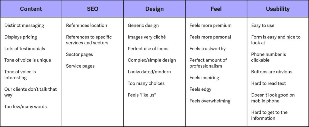
1. Work out where you are now – be critical!
Using the table below as inspiration, as well as the five key elements discussed in the report, where would you score yourself? Make a map of your strengths and weaknesses, and use those as your baseline for improvement.
2. Improve your headers
Rewriting your entire site can feel daunting. But tweaking your headers across your homepage and service pages is a small task that can have a big impact on both findability and user experience. Make sure you spell out exactly what you do – users are busy, and want to know they’re in the right place.
3. Introduce clear calls to action
Make sure your users know where to go. Introduce buttons, in a colour that stands out, with clear text like ‘Get a quote’. Be consistent; users will remember that a certain colour means something’s clickable. If you’ve got two buttons, make the secondary one more neutral.
4. Address the user’s pain points
People are on your website because they’re looking for a solution to a problem. In your fixed copy, reference common things clients and prospects ask you. Demonstrate empathy and understanding, and don’t be afraid to state the obvious. People are busy and want to know that you have a solution.
5. Have a plan
This comes back to usability. Spell out exactly what you need from people, how your process works, and what they can expect. Do this in as few steps as possible – no more than four.
When people are ready to buy, they want it to feel easy. Link your ‘how we work’ to a clear call to action, and make it as straightforward as you can.
6. Give yourself a voice
People buy people and nobody (except maybe other accountants) wants to read something that feels like it’s been written by an accountant.
Honestly, trust us. Spend some time thinking about how you’d like to come across, shape that into some dos and don’ts, and use that as your tone of voice guide. Speak directly to your audience, in a language they understand, and you won’t go far wrong.
7. Make sure the design isn’t hindering your SEO
This is an easy fix – optimise your images! Images make a website look great, and they’re integral to design. But if they’re big, they’ll slow your site down, and each second counts.
Compress them using sites like tinypng.com and aim for all images on a single page to be less than 250KB.
8. Get testimonials
We’ve talked about trust – and nobody can sell you to new clients better than your existing ones. Make sure you’re featuring testimonials on your website, whether that’s by using a review platform or highlighting case studies. People want to hear what others’ experiences have been like.
One highly effective approach to achieve this is to make product video reviews. A video can capture the authenticity and sincerity of your customer’s experience, presenting it in a way that’s engaging and relatable. Such testimonials have a higher impact, as they provide a richer viewer experience, including visual cues and tone of voice that speak volumes about the customer satisfaction levels.
9. Prioritise communication
In the report, we found most websites looked at had contact information available, but that information was often hard to locate. 86% of sites had a contact form.
Make it really easy for people to contact you, and you’ll be surprised at how many leads come through. If you’re listing phone numbers and email addresses, make them clickable (for mobile, too). Consider what other channels you could make the most of, like live chat, and feature this information prominently.
10. Don’t be afraid to ask for help!
You probably say it to your clients all the time: why should they spend hours wrangling with the numbers when it’s not what they went into business to do? We say the same to you. If writing and branding isn’t your thing, don’t spend hours struggling to put a blog together or tinkering with colour palettes – ask an expert to do it for you, and use your time doing what you’re best at.
Download the full report: Small changes stack up: an accountant’s guide to a brilliant website for more insight.