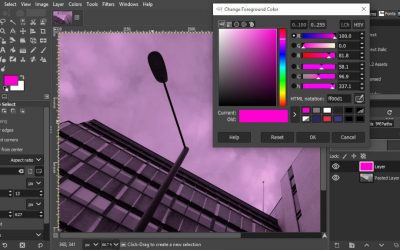
With my graphic designer hat on, of course I love clean, minimalist websites. They’re often the ones that grab attention and win awards. They’re a great way to make a bold statement about brand, too.
What is a minimalist website? It’s one with very little written material and lots of empty space. It might have a navigation bar with just a couple of links, aiming for simplicity and elegance. Pages on this kind of site often have high-concept, mysterious, almost poetic page titles.
The problem is, pretty as it might look, this isn’t good for generating business and capturing leads. That is exactly what most of PracticeWeb’s clients – accountants in practice – want to do.
For one thing, as our in-house expert in SEO for accountants will tell you, search engines need text, and the more the better. That’s because sites with just a few words of copy, possibly a bit conceptual and abstract, are cool, but they don’t give Google anything to latch on to.
And the more pages you have, the more room you have for meaningful text on specific topics, or targeting particular groups of desirable clients.
What does ‘Energise’ mean in this context?
User experience
Confusing page titles in an over-simplified navigation bar with just a few links are as much a user experience (UX) issue as they are a problem for SEO.
If you’re trying to make sales, you want people who land on your website from whichever route (Google, referrals, social media) to be able to find the information they need to make a decision. What will give them the confidence to get in touch or sign up for your services as quickly and easily as possible?
If you call your ‘About us’ page something like ‘Enter the maze’ or hide it behind a cryptic image, even if its fits with a brand concept you’re excited about, you’re forcing potential clients to jump through hoops. And most won’t – they’ll tut or growl and click ‘back’.
Current UX thinking is that users are happy to scroll – think about what it’s like to use Facebook, Amazon and Twitter these days – but if more than one or two clicks are required to find the page they need, or the copy makes it hard to work out what’s where, they’ll get frustrated.
And if users get frustrated, evidence suggests, they’ll just give up and go to another website.
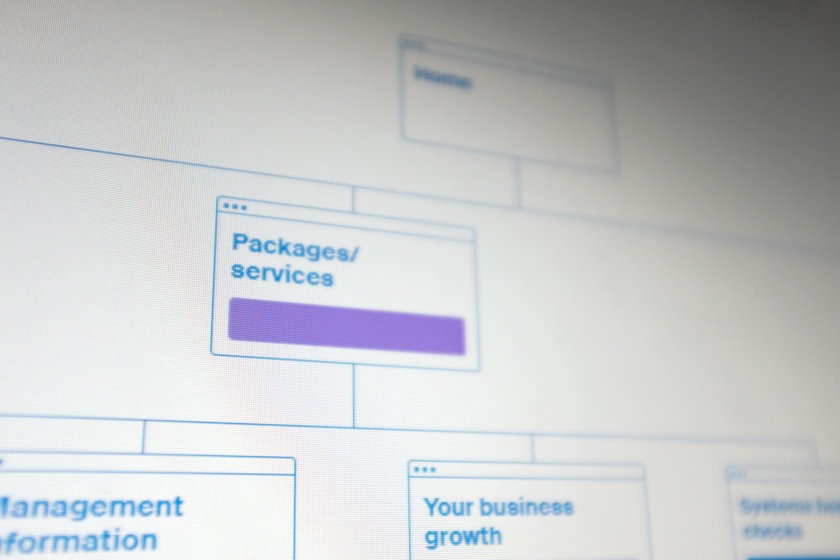
A sensible, comprehensive page structure for an accountancy firm’s website.
We can’t all be Apple
If you’re a well-known, established consumer brand with loads of authority and credibility in the marketplace, it might not matter. People already know what those businesses are about, they like or trust them, and so will
But if you’re a firm of accountants with lots of competitors you probably don’t have the luxury of promoting style over substance.
You’ll probably want a fully-fleshed out page structure, quite literal in its approach.
And don’t be coy – with SEO in mind, use the word ‘accountants’ or some variant quite prominently, and probably also the name of the town, city or region where you operate.
And the navigation will probably need to be more or less conventional – no visual metaphors or confusing interactive devices.
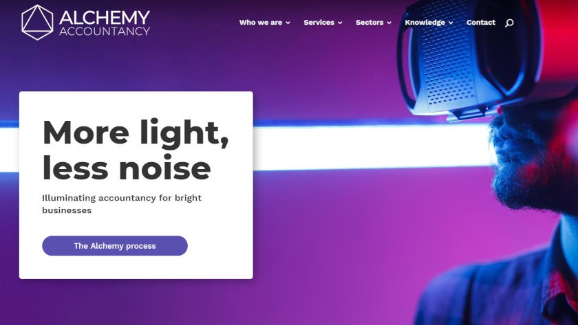
Alchemy Accountancy – bold and distinctive, but also intuitive and user-focused.
Distinctive and user-friendly websites
Now, the good news is that being pragmatic about this kind of stuff doesn’t mean your website can’t look good or convey a strong sense of your firm’s unique identity.
Within a conventional structure you can say a lot with colour, typography, layout and choice of imagery. And copy, of course.
Does your brand have rebel energy, bring enlightenment or have a premium industrial feel? Believe it or not, these are all underlying concepts we’ve used recently to help underpin copy and design on websites for UK accountancy firms.
And even if your website follows a best-practice, fairly conventional structure – with individual service and sector pages, for example – you can still get some of the look and feel of minimalism with white space and graphical simplicity.
It’s a bit like building a house vs. decorating and furnishing it, I suppose. The structure of the building isn’t the best place to express your personality. Unless you’re one of those Grand Designs types, you probably want to follow standard construction principles so it won’t fall down or let in the rain.
The takeaway
Ultimately, good web design isn’t about creating websites that look stunning but don’t perform – that don’t address an accountancy firm’s needs and project objectives.
Rather, it’s about achieving a delicate balance between the requirements of SEO, user experience and design best-practice.
Further reading:
Get in touch to find out about our websites for accountancy firms.
Like and share this post using the buttons below.