
There’s a famous pop experiment that proves this point. The American documentary maker Errol Morris became fascinated by accounts of how fonts influenced readers’ perception of the authority of the author. He began to collect stories such as that of the student who suddenly began to get higher marks for papers when he changed the font.
Morris decided to use his regular online column with the New York Times to test the extent to which people might be influenced by typography. Here’s how he explained it in 2012, after the experiment had concluded:
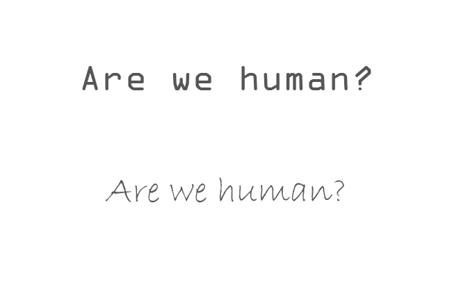
I picked a passage from David Deutsch’s second book, “The Beginning of Infinity” — a passage about “unprecedented safety” — and embedded it in my quiz for The Times, “Are You an Optimist or a Pessimist?”… Each Time participants read the passage in one of six randomly assigned typefaces — Baskerville, Computer Modern, Georgia, Helvetica, Comic Sans and Trebuchet. The questions, ostensibly about optimism or pessimism, provided data about the influence of typefaces on our beliefs… The test consisted of comparing the responses and determining whether typeface choice influenced our perception of the truth of the passage.
The test showed that people were most likely to agree with the passage when it was set in Baskerville, a 200 year old serif font, and least likely when they saw it in Comic Sans, the informal font we all know from school newsletters and posters on the noticeboard at the doctor’s office.
They were also more likely to actively disagree with Comic Sans and least likely to disagree with Baskerville.
Now, before you all rush off to have your website republished with all the copy in Baskerville, it’s worth saying that the difference was statistically significant but not enormous.
It’s also worth bearing in mind that Comic Sans is an extreme example – very few accountancy firms would ever even think about using it on their websites.
The point is, though, that fonts, along with every other small design or copywriting decision, make a difference and are worth thinking about.
Conveying humanity
Another experiment, carried out by researchers from computer giant IBM, found that fonts influenced whether users thought text had been written by a human, or computer generated.
The text they used was actually a dialogue between a client and a financial adviser, so somewhat relevant to the world of accountancy.
The four fonts they tested were:
- OCR-A, a font designed to be legible to scanners
- Georgia, a serif font similar to Baskerville
- Helvetica, the quintessential sans serif font
- Bradley, a font designed to look handwritten
OCR-A, top, and Bradley.
After two rounds of testing, the team concluded that people were more likely to assume text presented in OCR-A had been produced by a chatbot or AI.
That’s no surprise, perhaps, but the researchers expected people to find the handwritten typeface more human which they simply didn’t.
In fact, one test subject felt as if fake handwriting was an attempt to ‘trick’ them.
So, trying too hard to look natural, warm and organic – over-compensating, if you like – can backfire.
Don’t guess, test
The best way to pick a font, or a set of fonts, to represent your business is to test some options with real users.
These days, that’s easy to do by creating some simple visualisations using Photoshop, or even Google Slides or Microsoft PowerPoint.
Pick a few phrases, such as your firm’s tagline and perhaps a vision statement, and set it in a few different fonts from your shortlist.
Then get some test subjects and ask them to rate each font for:
- authority
- warmth
- clarity
- and any other value that’s important to you.
In the case of PracticeWeb, for example, we might ask people to rate the extent to which the fonts we use (Galano Grotesque, with Poppins as the fallback substitute) convey intelligence, as per our tagline “Intelligent marketing for accountants”.
Follow the example of others
If you’re having trouble narrowing down a choice of font, why not start by looking at businesses your accountancy firm aspires to be like?
It might be other accounting or financial businesses or, more laterally, car brands, consumer products or technology firms.
Get your list together then gather some examples of how they use typography, from the website homepage to billboard advertisements.
Examples of logos conveying authority, intelligence and analytical power.
Question one: do they tend to use serif fonts, sans-serif, or something else?
Question two: are there are any particular quirks or trends you notice? For example, are they condensed, light, fat or italicised?
Question three: is there one example you especially like? Try to articulate why.
For example, you might look at the typography used by sportswear manufacturer Nike and think it suggests modernness, confidence and cleanness.
If those tie into your firm’s values, you might consider using the same font (Futura Condensed) or something similar, such as Google’s free font Oswald.
Oswald at various weights, designed by Vernon Adams for Google.
General principles
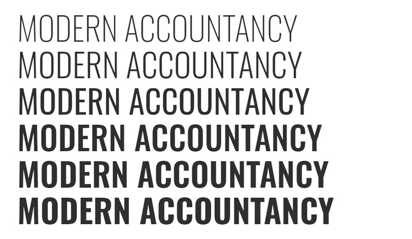
In the most general terms – backed up by some of the research above – serif fonts are best if you want to suggest authority, heritage and conservatism.
Sans-serif fonts tend to seem more open and convey modernity, clarity and a certain sharpness.
The chances are you won’t want to use any handwritten or more unusual display fonts, except perhaps for emphasis here and there, or maybe in a logo. If you do, make sure to consult someone with a good eye and great taste – the graphic designer’s superpower – to make sure you land on distinctive rather than wacky, silly or just plain weird.
And remember, ultimately, the most important thing, trumping aesthetics or brand values, is clarity and useability.
A font that’s hard to read, or illegible when viewed on small screens, will send the wrong message altogether.
Get in touch for an intelligent approach to branding and web design for your accountancy practice.
Like and share this post using the buttons below.