PracticeWeb designers Mark Jones and Jacob Pugh, and editor Ray Newman explain how accounting websites go from blank page to the finished product.
Building some of the best accounting websites in the UK is the end result of a creative process that continues to evolve.
The editorial and design teams at PracticeWeb are made up of creative people – professional writers, web designers and user-interface experts with years of experience.
In fact, when we’re not producing content and accounting websites at PracticeWeb, we spend our free time taking photographs, making films, writing novels, illustrating books… You get the idea.
That’s why, to some extent, creativity feels instinctive to us, and putting this blog post together has been interesting because it’s made us think about how we actually do what we do.
The first step in every case is finding a way into each firm’s identity – a key that unlocks ideas which inform the visual approach and the language we use.
This is what gets us excited about each project and helps us create websites as divergent as NR Barton and Alchemy, while adhering to user-experience best practice and making the most of our own Horizon platform.
What do we already have?
Sometimes we have a blank canvas to fill, but not always.
If a client comes to us with existing brand values, colours, typography, logo, tone of voice or any other assets, we’ll always look at those first.
In the case of Harold Sharp, another agency supplied the high-quality design work and we were able to pick up the baton and develop their overarching brand strategy.
Occasionally, though, there are colours and there is some flexibility over specific tones. One recurring issue is firms whose colour palette was designed a few years ago, partly with print in mind, and so seems muted or restrained in 2019. Where we can, we’ll often dial those up to pop on-screen, while maintaining integrity with the original brand.
There is usually less flexibility around logos, especially if they’ve been printed on thousands of business cards or displayed prominently on and around a firm’s premises.
Zincbooks, a website currently in development, is an example of a client who came to us with a really nice, professionally designed logo that immediately set the tone for the work that followed.
Others might need work, though. We’ll always tell clients frankly if a logo is not up to scratch and offer advice on how it can be improved. If the changes needed are straightforward, with the client’s consent, we’ll tidy it up as part of the design process. If they’re more substantial, we also offer a fuller in-house logo design service.
A few common issues with logos are:
- The words ‘Chartered Accountants’ or similar as a built-in strapline. This works fine on printed letterheads but on-screen is often too small to be legible. And, anyway, by the time a user gets to your website, they already know what you do, or can see this information in the website copy.
- A lack of responsiveness. These days, it’s standard practice to design logos that resize elegantly with the screens they’re being displayed on – first stacking elements, then removing elements, usually ending up with just the logo mark. The website responsivelogos.co.uk collects lots of examples of famous brands – do take a look.
- No alternative versions. A properly designed logo will usually come in brand colours as well as a white or black version for display on dark or light backgrounds.
Summoning a unique identity for accounting websites
The next step is fleshing out whatever we have into the basis of a full website design.
The most ambitious practices will go through our full brand strategy process, which enable us to elicit the essence of what the firm is about. What sets it apart? Who are their ideal clients? And so on.
The more time we spend thinking and talking about this with our clients, the more we have in our toolbox when we move to the creative phase. And, importantly, the greater the sense of ownership those firms will feel for the end product.
Some firms are at a different place in the journey, however, and want to get a good-looking, distinctive website live with a smaller investment. In these cases, we supply some DIY tools to quickly establish a basic brand identity. For example, is your firm more formal, or casual? Serious, or witty?
There’s also a simplified version of the full buyer persona exercise we undertake in our workshops, which can help practices get some idea of their ideal clients.
 Get our free guide to creating your own buyer personas.
With the outputs from these exercises and from the conversations our account managers have in the initial stages of the project, we can move onto brand development.
Identity and tone of voice
Now, we need to say upfront, this isn’t ideal – good brands are not quick or easy and they need time and thought to be most effective and durable.
But our process is considerably better than nothing and is the first taste some of our clients ever have of anything like a brand strategy.
Here’s how it works. First, one of our editors takes everything we’ve got and pulls out key themes, words and values, eg ‘precision’. They then use this as the basis for a mind-map, like this, for an imaginary client called Javelin Accounting:
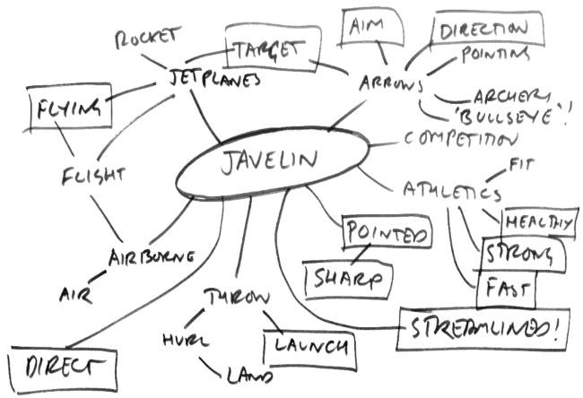
Our copywriter’s mind-map with ideas branching out from the trading name of an accountancy firm.
This helps explore more ideas, sometimes tangential or a step removed from the obvious starting point. After several iterations, we’ve usually created a concept that can be expressed in two or three words, such as:
- premium industrial
- no-nonsense mentor
- forward movement
- light and clarity
- targeted and direct
The mind-mapping exercise also provides a list of words and phrases that form a kind of palette:
- direct
- direction
- streamlined
- launch
- flying
- flight
- strong
- fast
- healthy
- sharp
- target
- aim
It’s a tool we can keep coming back to throughout the process to find ways of expressing familiar ideas in new ways.
‘We tailor our service to each client’ is not unique, but ‘Javelin shares your targets and helps you hit them’ is, to give a rather on-the-nose example. It’s usually more subtle than that – an underlying theme that subliminally reinforces how clients and prospects view your firm.
The editor will also usually put together some sample copy at this point – six or seven variations of the main title and subtitle for a homepage, usually, showing how the language might work in practice.
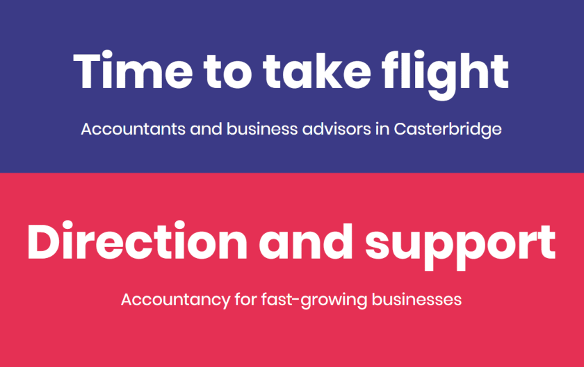
Headings and subheadings working in harmony, blending brand, information and SEO requirements.
This informs a tone-of-voice guide, a bespoke document specifying the nuts and bolts of the writing before writing for accounting websites.
Does Javelin start sentences with ‘And’? Does it use long sentences, short ones, or a mix? Which specific words and phrases should be avoided?
We talk to clients about this as we go, ensuring they are happy with the direction. In some cases, even if the concept we’ve come up with doesn’t quite work for them, pushing back against it helps them express what would work.
Words and pictures on accounting websites
It varies from project to project but, typically, this is when the editor hands over to a designer. The designer finds ways to reflect or complement the copywriting concept in the look and feel of the website.
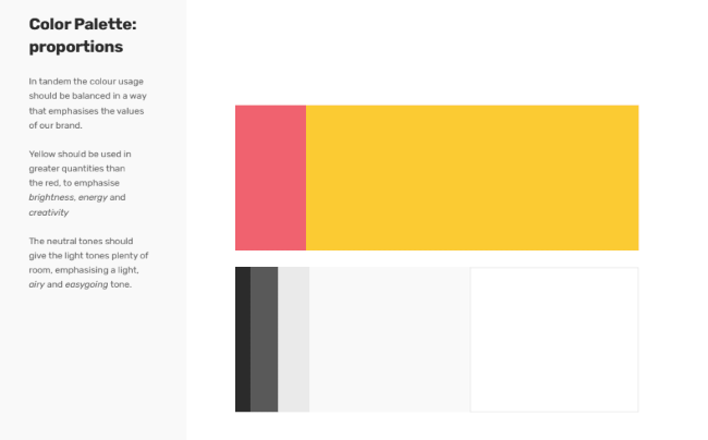
An example of colour palette guidance for a bold web design for an accountancy firm.
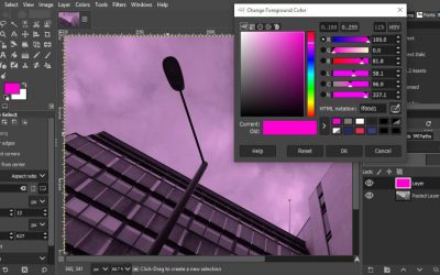
They put together a colour palette using hex codes to ensure consistency, testing the colours for contrast and clarity. Often, this also means choosing a stand-out contrast colour – one which complements any existing branding but also means buttons and calls to action will pop on the page.
With the concept in mind, they define an overall image strategy – people but no faces in shot, for example, or monochrome and abstract – and then source photography to fit, tweaking it for consistency as needed.
Typography is perhaps the most subtle part of the process and most people are only vaguely aware of the signals sent by one font or another.
As well as choosing fonts that reinforce the brand, the designer considers how clearly they display on different devices, how well they scale, contrast, legibility and other factors affecting the user experience.
An example of a custom icon set for an accountancy firm’s website.
They might also produce illustrations, icons and other unique design elements, depending on the brief.
In the final design, the connection with the copywriting concept is not always obvious – ‘premium industrial’ won’t necessarily be reflected in images of rivets and factories. More likely is that the designer will target the repeated geometric shapes typically found in sheet metal products and use those as the basis for background images.
In other cases, it might be more literal – if the theme is light and clear, the photography might feature neon, for example.
Sometimes, it’s a matter of give and take. If the copy is bold, the design will sometimes be more sober to balance it. This is a great way to convey both professionalism and approachability. The site we designed for Hurkans is one example of this.
Pulling it all together
In the final phase, designers and editors work closely to ensure any SEO objectives are met, the user journey is clear, and we’ve really answered the brief. After all, there’s more to generating leads than design and copy.
When you’ve only seen structure diagrams, documentation and mock-ups, it can be hard to envisage the final product so there’s often a eureka moment when we show the finished product to the client and hear them express genuine delight.
Get in touch to talk about our web design for accountants and feel free to share this using the social media links below.