Summary
The font you use can say a lot about your accountancy firm’s brand and personality. But with so many typefaces available, choosing can be difficult.
Our websites for accountants are designed with your clients in mind.
Things have been getting a bit geeky on the PracticeWeb blog in recent weeks with posts about full stops and the technicalities of SEO. Now it’s our design team’s turn to get stuck into one of their favourite subjects – typography.
It’s 2019 – everybody knows you don’t use Comic Sans in a serious design for business. Even the creator of this famous font agrees.
Papyrus isn’t far behind in terms of the disdain in which it’s held by designers while Helvetica, though undoubtedly a classic, is a bit played out.
The good news is, there are now more beautiful typefaces available than ever before, ready to install and start using for free or a fee in seconds.
The bad news about that good news is that the choice can be paralysing.
Here’s how PracticeWeb’s team goes about choosing the right fonts to represent the accountancy firms we work with.
Types of font
There are two main categories of font:
- serif
- sans-serif
The most famous example of a serif font, simply because it’s installed on almost every computer in the world, is probably Times New Roman.
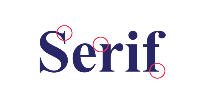
Times New Roman in action, with some serifs circled.
Serifs are those little bits that stick out at the ends and corners of letter, circled in the diagram above.
Serif fonts are based on classical forms – the kind of lettering you might see carved into stone in ancient Rome – and the early days of the printing press. That’s why they suggest conservatism, seriousness and tradition. Think The Times or the Daily Telegraph.
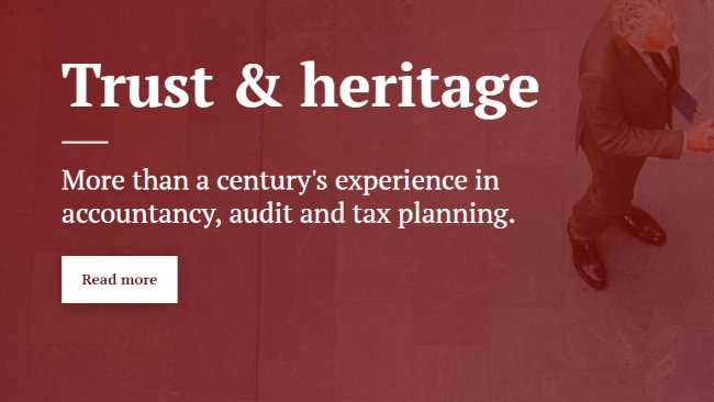
An example of a serif font on an accountant’s website.
When we’re dealing with a firm that wants to convey traditionalism, quality and intelligence, we’ll often look at serif fonts first.
Sans-serif fonts emerged in the 19th century but really became popular in the 20th. With their clean lines – without those little bits sticking out at the ends – they chimed with modernist design from Art Deco to minimalism, and in the 21st century are popular with tech companies such as Apple and Google.
The most famous sans-serif font is Helvetica and its many variants, forming a subset of sans-serif known as ‘grotesque’, or ‘Swiss’.
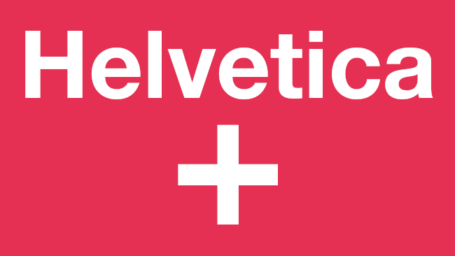
You’ll know Helvetica and its derivatives even if you didn’t know its name.
Grotesque san-serif fonts suggest a sort of straightforward functionalism. Rail Alphabet, the font traditionally used on the British train network, is another example.
Geometric sans-serif fonts such as Futura are subtly different – they might render the letter O as a perfect circle, for example, or a lower case L as a simple straight line.
There are lots of great modern examples in both styles. PracticeWeb uses a chunky geometric sans-serif called Galano on its website.
Grotesque and geometric sans-serif fonts can suit accountants that identify as modern and that want to convey a certain cleanness of line. You might say they’re tranquil.
Another slight variant are humanist sans-serif fonts. These sit somewhere between serif and sans-serif, bringing certain classical letterforms into the mix. Here’s how Gill Sans, sometimes called the unofficial font of Britain, handles a lowercase A and G:
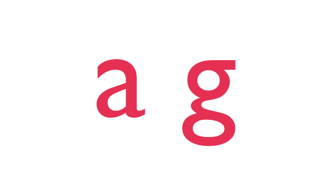
Gill Sans – elegant and very British.
Johnston, designed by Edward Johnston in 1916 for London Underground, inspired Gill Sans and is another famous example of humanist sans serif.
Fonts like this can convey both steadiness and nostalgic warmth – “Keep calm and carry on”.
There are many other types of font, from script to slab serif, but those rarely work for accountancy websites, except perhaps as components of logos.
How many fonts?
We’ll generally avoid using more than two distinct fonts on any website, because we don’t want them to end up looking like a Victorian circus poster.
We can still achieve visual variety by using different weights and variants of each font, though, and by using them in tandem with the brand colour palette.
As a rough guide – but by no means a rule – we’ll often use one sans-serif font and one serif. This can help headings contrast with body copy and aid legibility.
Focus on the user
Look and feel aren’t the only important factors when choosing a typeface for your website – you’ve also got to think about the end user.
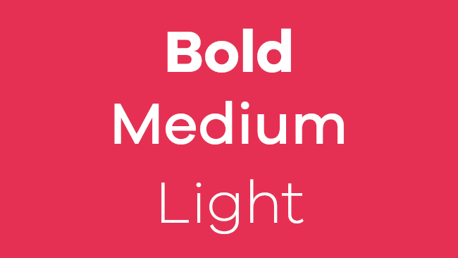
The same font (Galano Grotesque) at multiple weights.
Serif fonts are typically thought to be easier to read on paper while sans-serif tends to be more readable on screen.
Because of their open shapes, geometric sans-serif fonts can be easier again to parse.
The distinctive shapes of humanist sans-serif can also make them faster for people to process, especially at small sizes.
And there’s a key point: with website design in particular, people use all sorts of different devices to access content. A font that works well on a high-resolution desktop PC monitor might be almost unreadable on a small, lower-resolution phone screen.
That’s why we always test fonts on a range of devices and work with different weights to maximise legibility.
Branding
Stand out from the competition, stop competing on price and start building your firm's reputation with a strong brand.

Licensing and permissions
It’s important to be sure that you hold the appropriate licence for any typeface you use on your website.
If PracticeWeb manages your website, we’ll look after that for you, but otherwise make sure you purchase fonts from reputable sources and carefully check the terms of the licence.
If you really want to use free fonts, look at the selection offered by Google.
They come in all styles, are optimised for web use and are generally free to use for any purpose, including commercially. But, again, do double check the terms of the licence.
We can help you with your website, content and SEO for your accountancy firm.