As a designer, there’s nothing quite like whipping the silk cloth off a redesigned accountancy firm website and hearing people say, “Wow, what a difference!”
In reality, the process is more gradual and collaborative but helping people fall back in love with their brand is always a goal we want to achieve.
Designing brand new websites for accountants is great fun, and more of a challenge in some ways, but it’s the before-and-after effect that really takes people’s breath away with a redesign.
It’s like on those reality TV shows where they take a rusty old wreck and turn it into an amazing muscle car – there’s always a bit in those where they fade from BEFORE to AFTER for maximum effect.
I recently led the design of a website for a new PracticeWeb client, Diamond Accounts. Their old website looked like this:
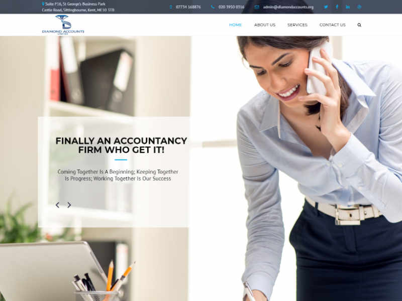
The Diamond Accounts website before we started work on it.
It lacks character, the photography is really outdated and it doesn’t reflect what the firm is about at all.
Now, after the design and copywriting teams have done our thing, Diamond looks like this:
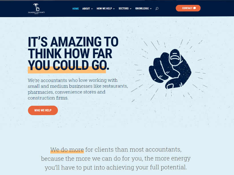
And after we’ve rebranded, redesigned and revamped it.
I’m really proud of that and the clients – I’m quoting now – “actually love it”.
It’s sharper, more modern and more distinctive, giving an expanding accountancy firm the digital presence it deserves for the 2020s.
I’ll go into a lot more detail about the process in another post later this week.
“We’re really excited about the new website,” says Bal Gora from Diamond. “It’s gone through an amazing transformation and now captures who and what we are.”
The funny thing is, most people would probably have struggled to pinpoint exactly what was wrong with the old website if you’d asked them.
I think that’s one reason why many accountants limp along with substandard websites for years on end – because they get used to it and don’t notice it slowly slipping into looking and feeling dated, or failing to keep up with user expectations in terms of functionality.
Logos for accounting firms
One specific aspect of website design where before and after really hits home is when we redesign or refresh client logos.
Sometimes, an accountant’s logo design just doesn’t match the quality of the website we’re building. That’s when we might suggest a redesign and often the client asks us to handle that as part of the wider project.
Now, the thing is, I don’t believe, as a point of principle, that you can ‘knock out’ an accountancy logo. Logos are important – they carry a lot of the weight of your brand identity and will be seen everywhere for years to come.
The best logos have a lot of depth and convey a complex message full of meaning, while at the same time looking clean and simple.
One recent example which demonstrates the thought and care that goes into logo design is the work another of my colleagues, Jacob Pugh, did for Property Tax Advisers (PTA) earlier this year.
Here’s what they came to us with…
This presented several problems, including repeated text, untidy line weights and a generally dated feel.
Here, after Jacob worked his magic, is where they ended up:
Getting there wasn’t easy.
At the risk of spoiling the magic, here’s a glimpse into the analysis Jacob undertook based on logos for firms in the same space, with similar values and identified by the client as appealing:
In fact, on this job, there was a logo in between that just didn’t quite work but it did help focus the clients’ minds on what they wanted, and how they wanted to come across.
 Looks aren’t everything
The really nice result above was the endpoint of a process, not something PracticeWeb pulled from the shelf.
Before we think about visuals, layout, fonts and colours, we first need to understand what the client wants to achieve, who they want to connect with as clients, and what makes their accountancy firm different to the competition.
In the case of the Diamond Accounts redesign, a brand strategy workshop helped us focus on Diamond’s core clients by defining buyer personas, and pin down the firm’s goals and values.
Then a content strategy session, with me eavesdropping throughout, helped us find some underlying concepts to hang both visuals and website copy on. What leapt out to me was a sense of adventure so that was my starting point for the design concept I came up with.
As well as the tried-and-tested approach to eliciting input from the client, though, just spending time with them is amazingly helpful.
It gives us a sense of how bold they might want to be (in this case, very) and makes their ‘tone of voice’ real, not abstract.
When we wrote taglines or I when I was choosing illustrations we could literally hear Sam and Bal speaking in our heads because we’d spent hours in their company.
A bit more eye candy
Now, like a bit of a fireworks display to finish on, here are a few more examples of where we’ve totally revitalised existing accountancy websites.
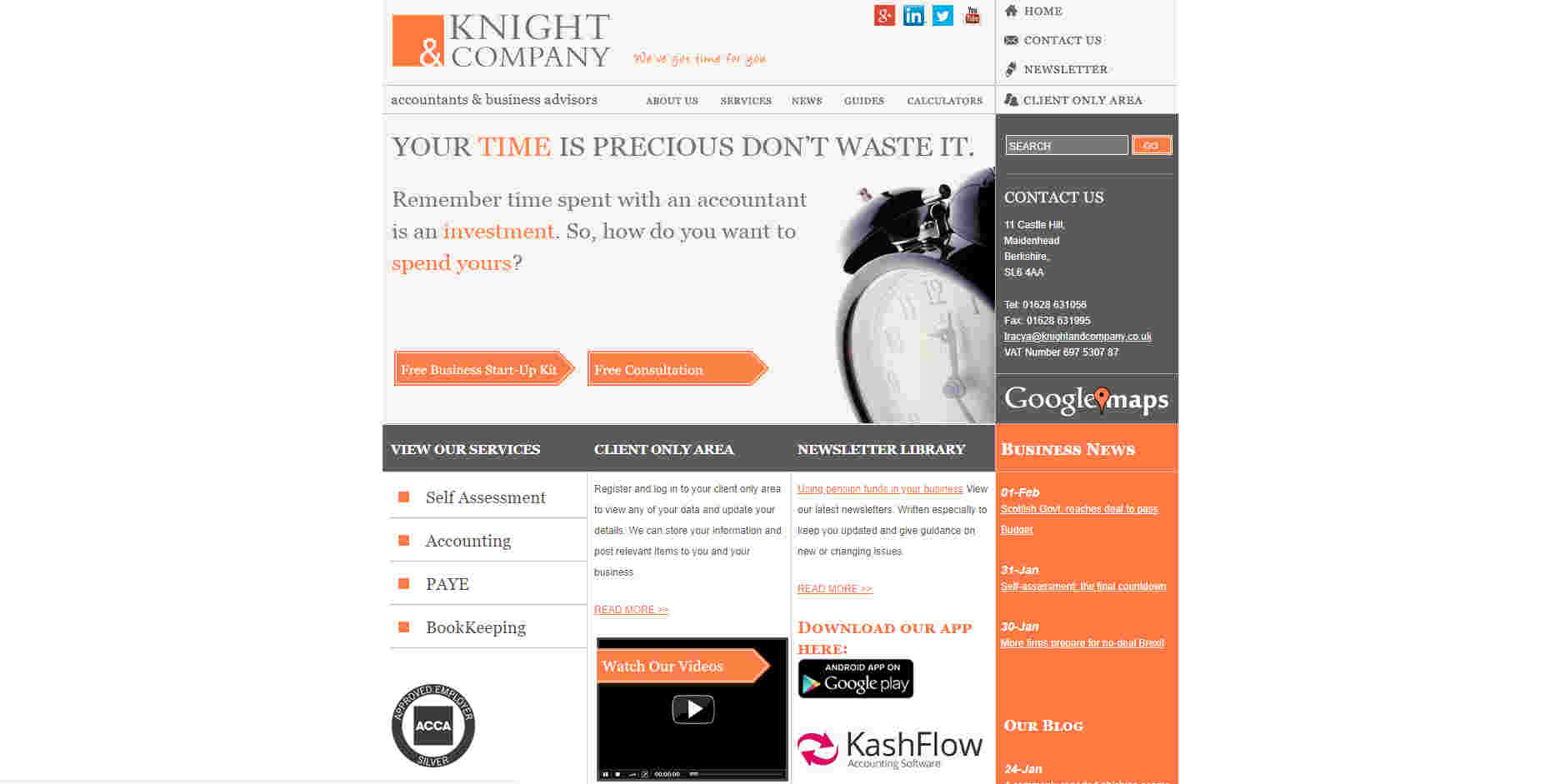
The Knight & Company website as it was at the start of 2020.
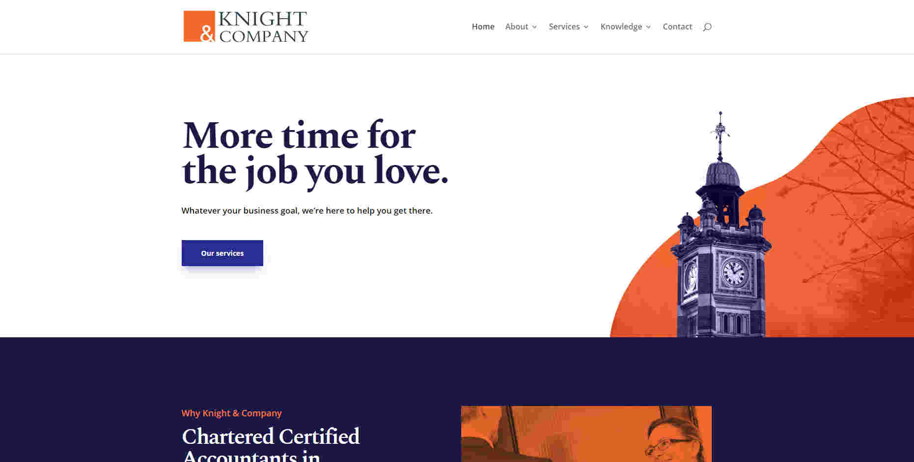
How it looked after our rebrand and redesign.
We gave Knight & Company a more contemporary look and feel by using bolder colours and more professional imagery, while retaining and amplifying an underlying theme around clocks and time that the client really liked. Instead of standard accounting blue and corporate red, we’ve gone for a regal purple and an orange that pops – not a common combination in the accountancy sector.
The logo refresh here is subtle – just that vibrant digital-friendly orange again and a serif font that speaks to tradition and quality.
Here’s another example – Ripe Financial, which came to use with a vibrant pallete, imagery of fruit and some issues with usability.
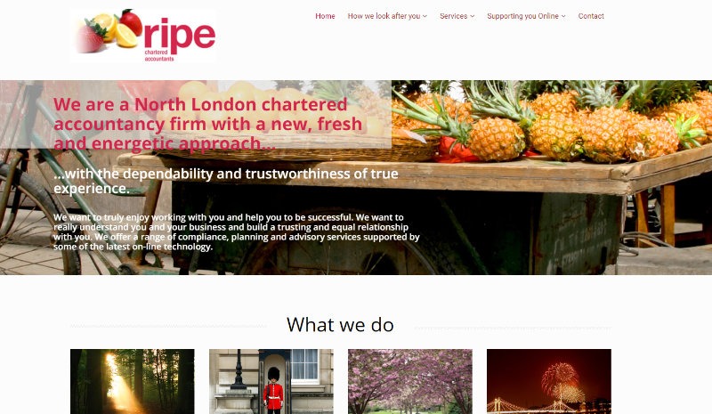
How Ripe looked at the start of 2020.
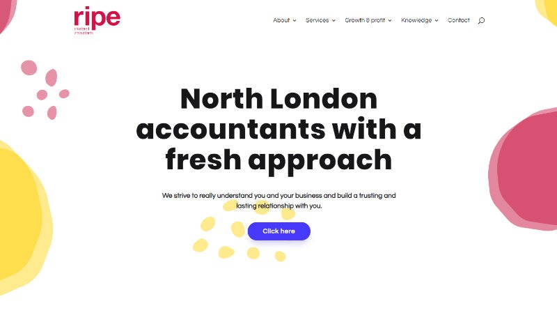
Here’s how it looked once Jacob had done his thing.
The redesigned Ripe website is a great example of how you can take one idea from an existing website – images of fresh fruit – and use it to infuse the new design with character, while also making it more subtle. Everything here, from the contemporary sans-serif typography to the bright colour palette to the abstract illustrations, sells this accountancy firm as modern, credible and approachable.
The logo uses a font and colour that gets across the idea of freshness, brightness and youthful zest. It’s an example of a quite simple accountancy firm logo design – just the name of the firm written out with careful balancing of each character. There’s no icon or graphic.
You’ve got to have faith
Unfortunately, there’s no way to quickly demonstrate the ‘after’ while we’re still at ‘before’ and getting to ‘Wow!’ is always going to be a process, not a finger-click.
We can show you the results we’ve achieved for other clients, though, and our approach is a transparent one.
We talk to clients throughout the redesign-refresh process, giving them the chance to react, comment and guide us on the journey.
More than just visuals
Finally, I really want to underline one thing: visuals dazzle and excite people but they’re nothing if using the website we’ve designed isn’t a pleasure, and if that website doesn’t help the accountants who come to us achieve their marketing and business goals.
Branding
Stand out from the competition, stop competing on price and start building your firm's reputation with a strong brand.
Talk to us about getting a new website for your accountancy firm that will generate leads, build your brand and engage the people with whom you most want to work.


 Looks aren’t everything

