In March 2018, Google announced the rollout of mobile-first indexing, which meant the version of your website viewed on a smartphone or tablet became the main event, not a sideshow.
I wrote about this at length last year but wanted to take a moment now, with a full 12 months’ experience of this new world, to reflect on what this has all meant in practice.
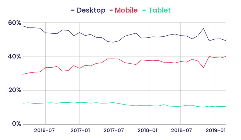
In the UK in March 2016, mobile searches made up just shy of 30% of the total. In March 2019, that figure had grown by ten percentage points to around 40%.
Throw in tablet devices and we can say that non-desktop searches are pretty consistently running at around 50% of the total.
Globally, mobile has an even higher share. Cheap smartphones and data are enabling many people previously excluded from the internet because of their income or location to get online for the first time.
And more than ever, we know that the experience potential customers have browsing mobile sites influences their decision-making. In February 2019, Mary Ellen Coe, president of Google Customer Solutions, summarised recent research from the global search giant:
54% of people say that as the load time for a brand’s mobile site increases, so does their frustration. And that affects the bottom line. In retail, we’ve seen that a one-second delay in mobile load times can impact conversion rates by up to 20%.
In November 2018, John Mueller, Google’ s Webmaster Trends Analyst, bluntly underlined on Twitter that there is no way to opt-out of mobile-first indexing: ‘The world has gone mobile already, we’re just catching up’.
In January 2019, Mueller also confirmed that mobile-first indexing was unrelated to mobile usability. In other words, even if your website isn’t remotely mobile-friendly – even if most of the content is hidden away in PDFs, for example – Google will still give preference to the mobile version, however ugly and non-functional, when constructing its index.
A post on the official Google Webmaster blog in December 2018 detailed the importance of ‘structured data’ and of something that feels as if it’s been part of SEO 101 forever: alt tags on images.
People have tended to be less careful about all this when it comes to the mobile version of their website – a big mistake.
This underlying information about the structure of the page, and the information contained in images, is vital in helping Google decide how your page ought to rank.
What all this means is that housekeeping matters, and that websites designed for smartphones or tablets have ceased to be an add-on or extra. And they’re only going to increase in importance as time goes on.
If you still have a separate website for mobile (understandable – it was the done thing a decade or so ago) or, worse, a website that shows a clunky desktop design whichever device it’s viewed on (pinch and zoom – no thanks, not in 2019) act now and get it sorted.
The risk otherwise is that however good your service, however good your content, and however good your search rankings today, you could find yourself slipping out of view in the very near future. If your competitors are up to speed with a mobile-friendly approach that might already be happening.