If you want your website to generate more of the right kind of leads, you need to make sure it expresses your firm’s distinctive qualities. Here’s how we did that for a recent client.
Recently, I talked about the power of before and after on websites for accountants, and how our recent project with Diamond Accounts was a prime example of this.
This was a great project to work on, not just because of the contrast between old and new, but because of the firm’s personality.
The directors of Diamond Accounts, Bal Gora and Sam Patel, have a real energy about them, and genuine optimism and enthusiasm for what they do.
Those are qualities that shine through when you meet them, but they were sorely missing from their old website.
While it contained the basic information a user might like to know about Diamond Accounts – where they were based, which services they offered – it gave very little sense of who they were as people, and as a company.
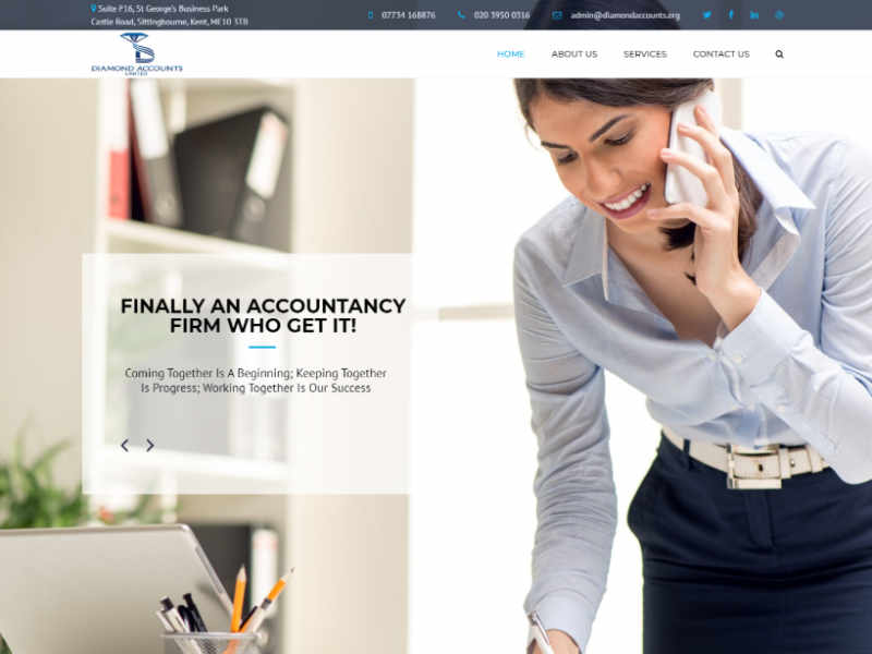
Diamond’s old website, before they came to PracticeWeb
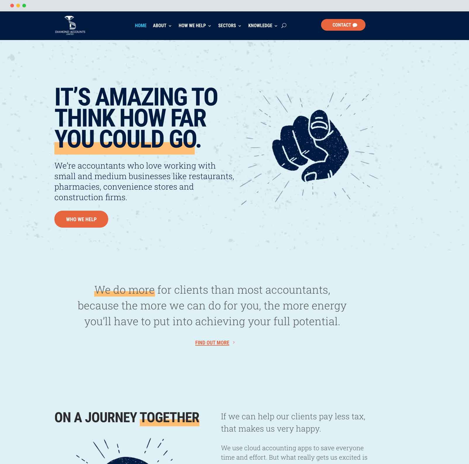
The new Diamond website, after working with us
This is important, because when you look at a business’s website, you’ll probably gain some kind of expectation about what it’s like to work with them.
That might not be a very strong impression, or even something you think about consciously, but it’s likely to set the tone for the next interactions you have with that brand.
We wanted to turn the Diamond Accounts website into something that reflected the way they saw themselves, and the way their clients saw them.
Working out the Diamond personality
As part of our strategy process for marketing and branding for accountants, we often ask our clients to name a celebrity or character they would identify with their brand.
This can be a fun exercise to get people thinking about the kind of personality they want to portray, and the ways in which their accounting firm is different from others.
We’ve had answers ranging from Sean Bean to the Queen, all with different associations that have helped us give each client’s brand a unique feel.
This is one of many approaches we take to finding out more about a firm’s personality. Sometimes, it just adds an extra dimension to the brand, giving us another element to work with when we’re looking for design inspiration or setting the tone of voice for content.
Occasionally, it helps to reveal something really interesting – something we can dig deeper into, and draw out the qualities that form the core of the client’s personality.
Sam and Bal picked out two names: comedian Paul Chowdhry, and fictional adventurer Indiana Jones.
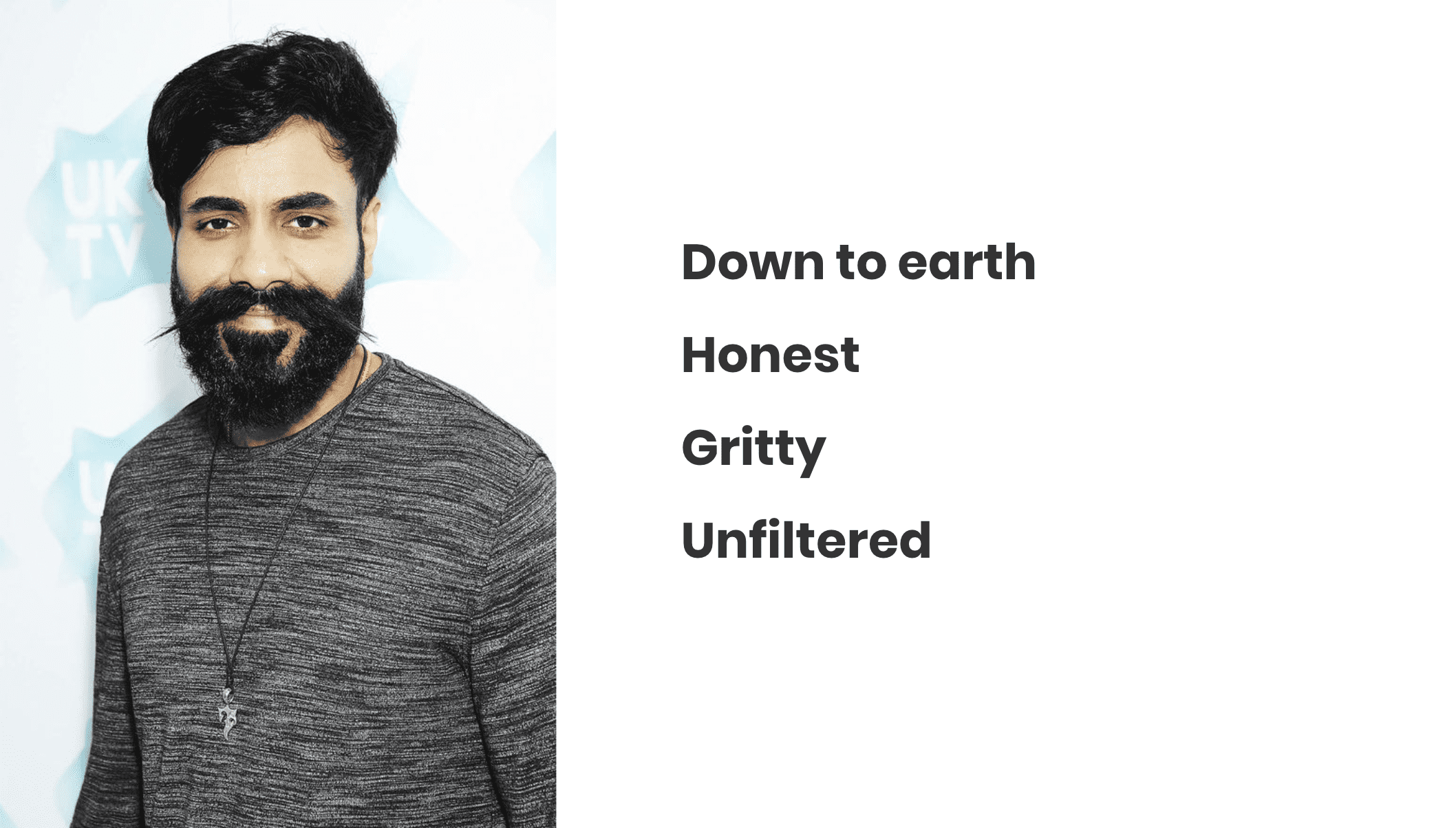
Celebrity personality one: Paul Chowdhry
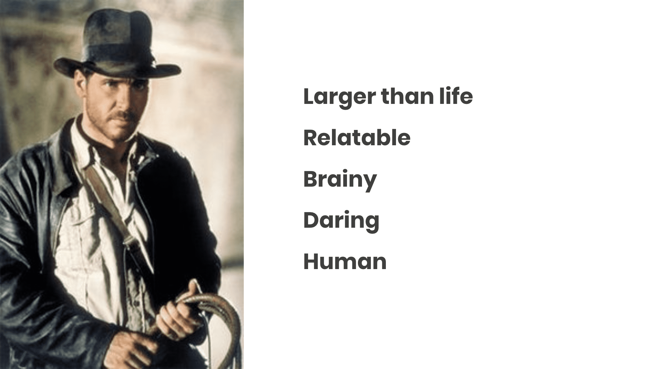
Celebrity personality two: Indiana Jones
These two strong personalities helped us to draw out some distinctive traits.
It might sound strange coming from a designer, but I always start with language when I’m working on a client’s branding.
We communicate with words, after all, whether we’re speaking with other people, writing an email or reading a book. Language is how we create human connections, learn new things, and explain our ideas to other people.
It makes sense, then, that the visuals should be grounded in description, to communicate what a brand is all about.
Working this way also means the design is consistent with the content that will populate the website, and aligned with the client’s business and marketing goals.
The copywriting toolkit we had already produced for Diamond Accounts was another helpful resource to draw descriptive language from. This brought out themes of motivation, laughter, mentorship and more.
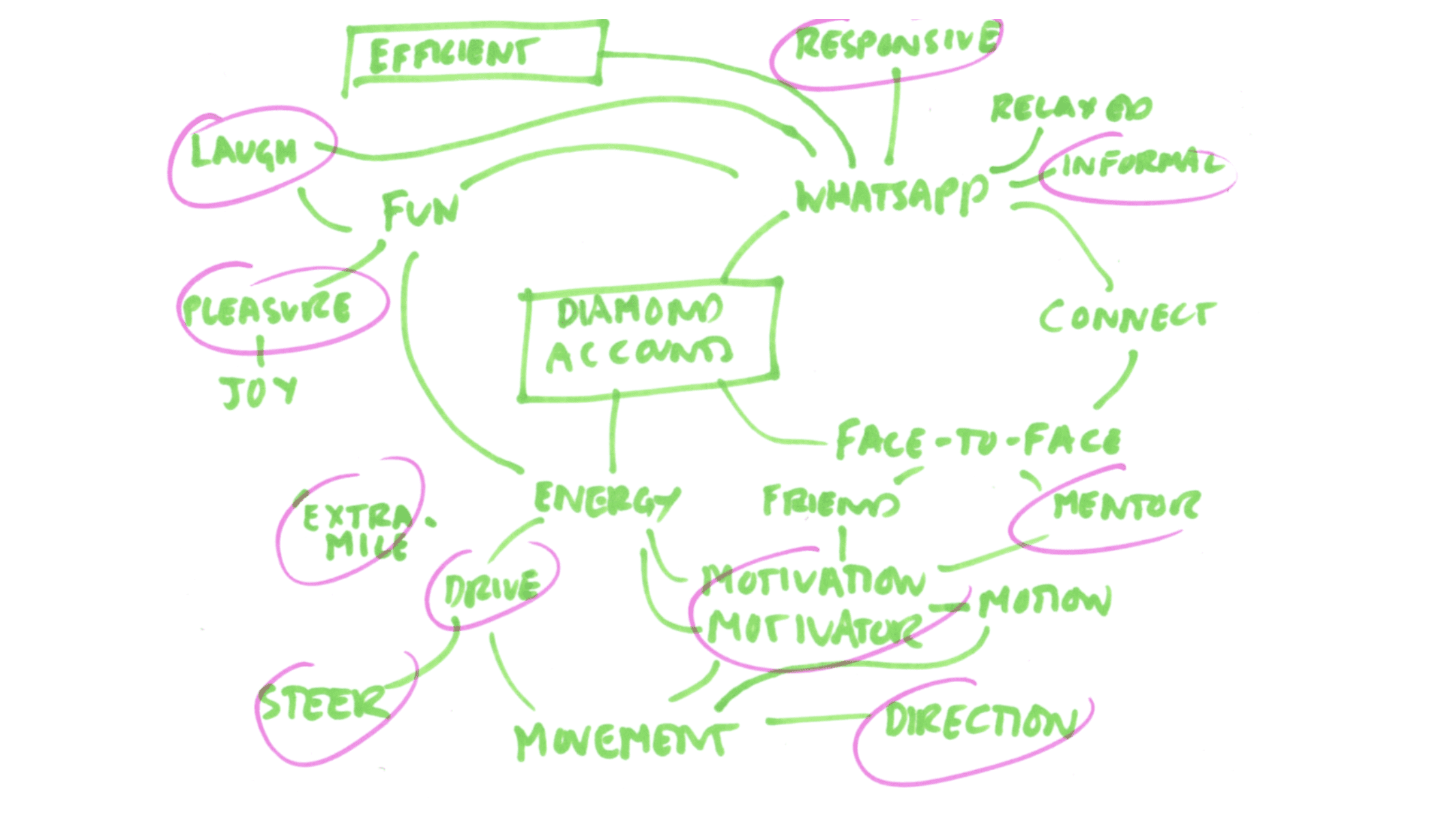
Themes: direction, informal, responsive, motivator, mentor, motivation, laugh, pleasure, extra-mile
Archetypes
The next step was to take what we knew about Diamond, and condense their brand personality down to its essentials.
In the branding and design world, we often do this by referring to one of 12 archetypes set out by psychiatrist Carl Jung.
According to Jung, these are universal symbols or themes that transcend time, place, culture, gender and age – they’re character types we’re all familiar with, that appear in literature, art and religion all over the world.
For me, assigning a brand an archetype is a really helpful way to direct the design process. It’s a way of stripping the elements of a brand back to its core, getting to know its underlying motivation, and giving it more of a human feel.
Like humans, businesses rarely fit into one archetype alone – they can be a mixture of two or more. This was the case with Diamond Accounts, whose brand personality lent itself to both the caregiver and the outlaw.
Caregiver
The caregiver is nurturing, benevolent, and just wants to be there for you. Often focused on family values, it seeks to reassure customers and build trust. It is never confrontational.
Outlaw
The outlaw seeks revolution. It wants to disrupt, challenge, and build a following. It encourages its customers to be themselves, and to go out and get what they want.
Can I have both?
Although an accountancy firm could easily fit into both of these boxes – you can care for your customers and have a rebellious spirit – brands are not as multifaceted as people are.
Ultimately, one of the archetypes needed to form the dominant visual direction for the Diamond brand, with the other coming through more subtly.
Visual direction
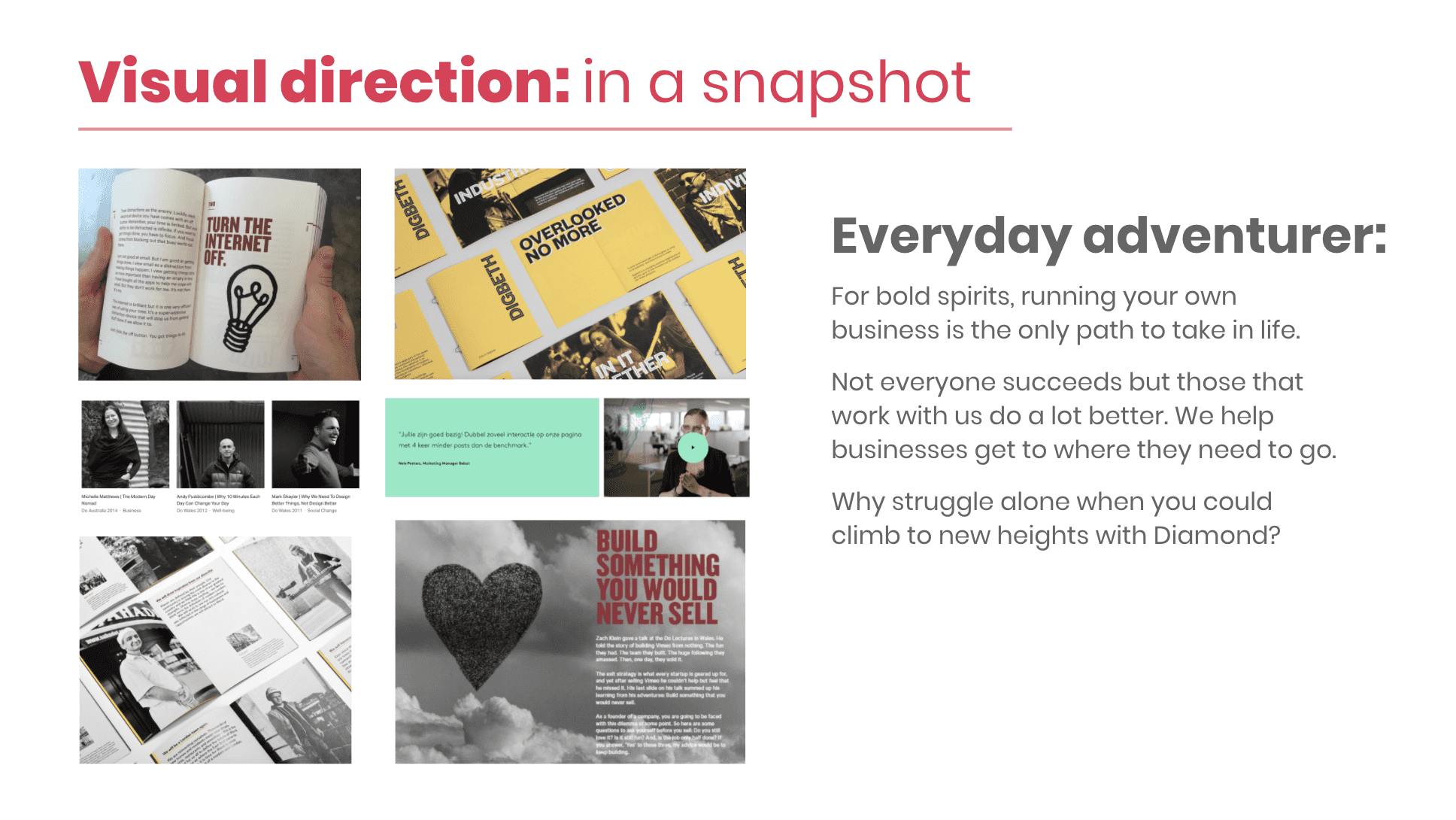
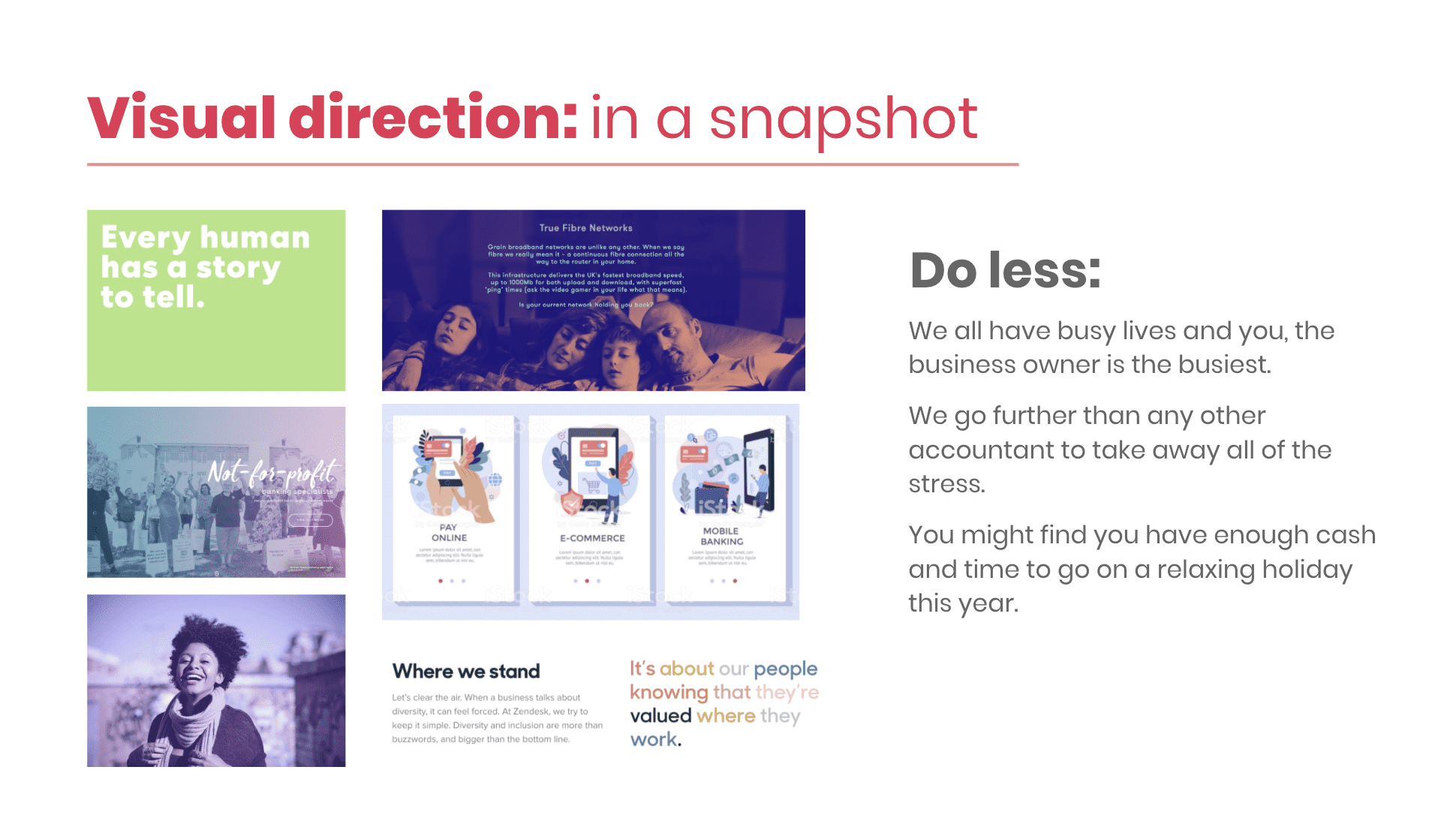
To work out which approach suited Diamond Accounts’ target clients best, I put together two distinct visual directions – one based on the caregiver archetype, which I titled ‘do less’, and the other based on the outlaw, which I called ‘everyday adventure’.
The first visual direction, ‘do less’, is bright, approachable and familiar, but still visually bold. It looks clean and professional.
The second visual direction, ‘everyday adventure’, is more minimal and punchy, with its focus on photography, stripped-back colour palette, and hand-drawn illustration style. It feels rugged and individual.
Trusting your gut
When given these options, Sam and Bal almost immediately went for ‘everyday adventure’. They thought it was bolder, more distinct from the competition and more suited to their personality – and I thought so, too.
We see a lot of accountancy sites that take the ‘caregiver’ approach, and while that makes sense for a client-focused service, it can be really hard to stand out if you’re saying the same thing, with the same visual style, as everyone else in your field.
The ‘outlaw’ offers a different take on the same service. It’s punchier, more direct, and more energetic – more like Bal and Sam.
Honing the details: colours, imagery and fonts
With a visual direction decided, it was time to develop the individual elements that came together to create the Diamond Accounts brand.
For this project, we decided to draw on the colour scheme of their existing logo and website. This meant they wouldn’t have to get a whole new set of business cards printed, or change the sign over their door, but it allowed us to give them a fresh new look for their digital presence.
Their existing website and logo relied heavily on shades of blue, which is by far the most commonly-used colour in accountants’ branding. That’s not necessarily a bad thing – blue is often used to signify trust, intelligence and stability – but it needed some secondary tones to lift it and make a visual impact.
To help them stand out, and to make sure their optimistic, friendly nature came through in the design, I decided to bring in some shades of orange and yellow.
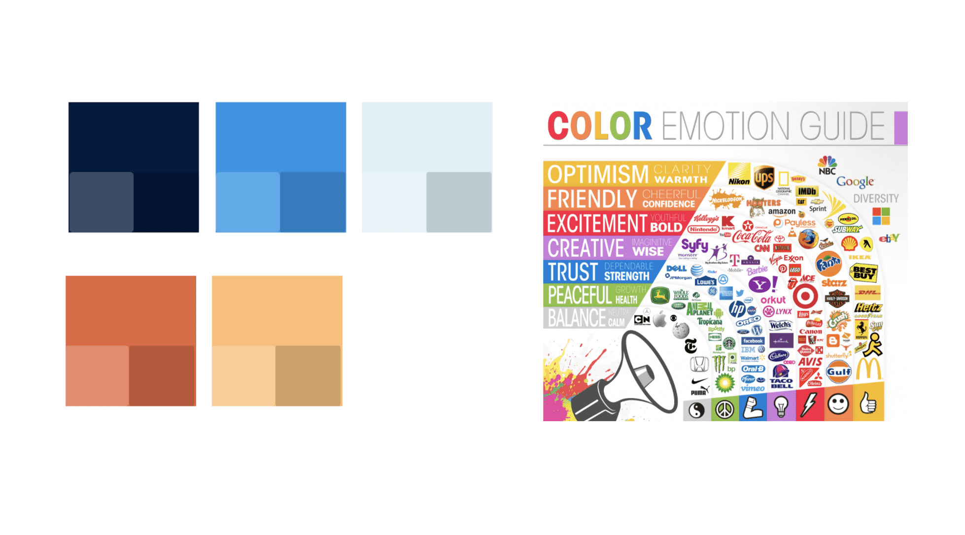
The emotional colour guide can be a good starting point when thinking about the impact of colour. Source: The Logo Company
When it came to photography, I settled on a black-and-white style that would capture the down-to-earth, ‘gritty’ feel of the brand.
I chose images that would portray the energy and diversity of small high-street businesses, and above all would feel authentic.
This meant taking care to avoid anything that looked like it was taken outside of the UK, came across as staged, or didn’t ring true with the kinds of people and businesses that Diamond Accounts works with.
It was important to make sure people from an Indian, Asian or Greek background were well-represented across the website’s images, as these groups make up a big part of Diamond’s client base.
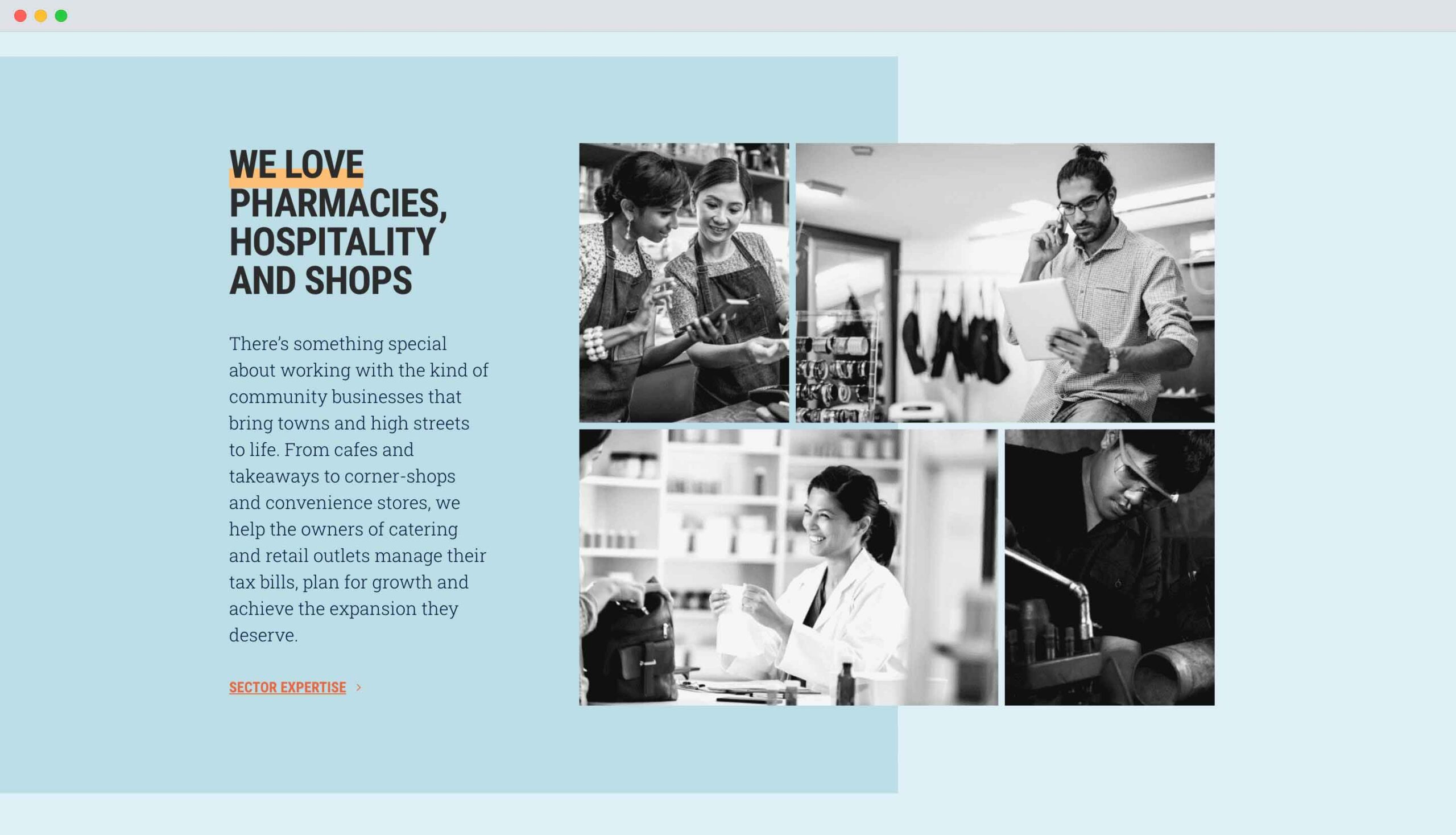
Photography on the Diamond Accounts website was chosen to authentically reflect their clients, with a focus on dynamic high-street businesses.
The illustration style was a bit trickier to get right, as Bal and Sam felt the first examples we presented, with a rough, hand-drawn style, came across as too childlike.
They wanted something slicker, with more visual detail, so we spent some time exploring an alternative direction. However, when put in the context of the other components of this design, something didn’t feel right about this alternative imagery.
Eventually, it became clear it was just too busy. More complex illustrations might look good in isolation, but combined with the rest of the website’s visual elements, they became confusing.
The breakthrough moment was when we returned to the original vision of a textured, lino-cut style, but focused on simple shapes and strong messages – from hands pointing or punching the air to show action and positivity, to a motorbike helmet to get across a sense of adventure and rebellion.
When we showed this new illustrative style to Sam and Bal, they agreed straight away that it was the right approach. As part of the overall design, the simplicity of the illustrations didn’t come across as naive or childish. It made them direct and memorable.
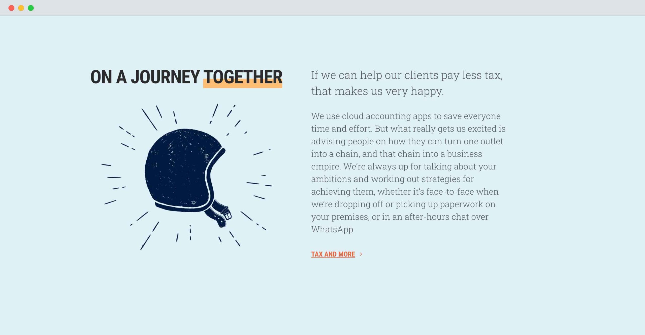
Next to the bold type and positive messaging in the website’s content, the simplistic illustrations helped to convey a sense of playfulness, while remaining credible.
Finally, the brand fonts needed to have the same look as the rest of the visuals – professional, but packed with personality. They needed to work seamlessly together, without clashing or appearing too overwhelming side-by-side.
Another factor to consider was making them accessible to the team at Diamond Accounts, so I chose open-source fonts that anyone can download and use.
I picked out the first font, Roboto Condensed, for its bold, sharp lines. It’s a font that would look at home on a poster, telling the world that “we have something to say”.
The secondary font, Roboto Slab, is a more rugged choice. When it’s displayed with a high thickness it seems old-fashioned – almost like the font of a Western steakhouse – but its lighter form gives it more of a techy look, striking the perfect balance between authenticity and modernity.
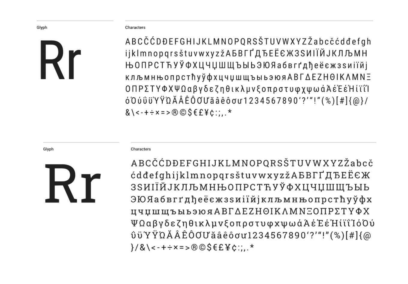
Side by side, the two font choices feel impactful and modern. They’re both available on Google Fonts.
What does your website say about you?
There’s so much to say about the Diamond Accounts website, from the bold typography and the distinctive texture of the illustrations, to the carefully organised site structure and hierarchy.
But every part of it is true to their brand, and designed around bringing the right clients to them.
If you haven’t given much thought to your website in a while, take some time to look at it again, and reflect.
What does it say about your firm, and the clients you work with? What does it tell you that’s different to your competitors?
If your answer to these questions is ‘not much’, now’s the time to think about getting a new website.
Find out more about our websites for accountants, or contact us and we’ll be happy to chat.
Like and share using the buttons below.